Basics of Graph Plotting – Comprehending the plot() Function in R
To start, this tutorial will focus on the plot() function in R, which is essential for creating various types of visually appealing graphs. Known for its extensive collection of functions, the R language offers great flexibility in generating and customizing graphs, and the plot() function family is particularly useful for this purpose.
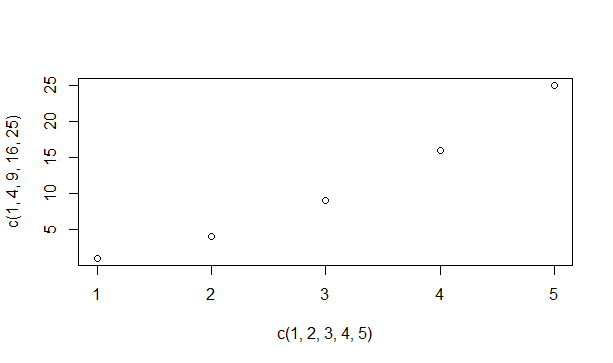
The plot() function in R is not a standalone function, but rather a placeholder for a group of interconnected functions. The specific function that is executed will vary based on the provided parameters. In its most basic form, the plot() function is used to visually represent the relationship between two vectors.
plot(c(1,2,3,4,5),c(1,4,9,16,25))
This provides a straightforward plot for the equation y equals x squared.
Modifying the way graphs look using the plot() function in R
As we will witness, the plot() function in R has the ability to be tailored in numerous ways for the creation of intricate and visually appealing plots.
-
- The appearance of the markers: By default, the plot markers are small, empty circles. These markers can also be referred to as plot characters, which are represented by pch. You can change the markers by specifying a different pch value in the plot function. Valid pch values range from 0 to 25 and offer various symbols on the graph. For example, pch 0 represents a square, pch 1 represents a circle, pch 3 represents a triangle, pch 4 represents a cross, and so on.
-
- The size of the plot markers: The size of the markers on the graph can be adjusted using the cex parameter. To make the markers 50% smaller, you can set cex to 0.5. Conversely, to make them 50% larger, you can set cex to 1.5.
-
- The color of the plot markers: You can assign one or multiple colors to the markers. R provides a list of colors that can be selected using the colors() function.
-
- Connecting the points with lines: Sometimes, it is necessary to connect the displayed points with different types of lines. This can be accomplished by specifying the type attribute in the plot function. Setting the type attribute to ‘p’ connects only the points, while setting it to ‘l’ connects only a line. Similarly, ‘b’ and ‘o’ are used for lines connecting points and overlaying points respectively. To achieve a histogram-like display, the ‘h’ option is used, and ‘s’ is used for a step option.
- Varying the lines: The line type can be specified using the lty parameter, which accepts values ranging from 0 to 6. Additionally, the line width can be adjusted using the lwd parameter.
Now, we can attempt to create some graphs using the knowledge we have acquired until now.
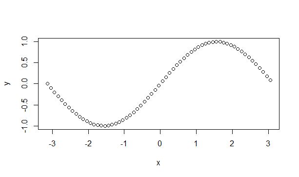
To start off, we will create a graph of a sine wave. Consider a sequence vector, denoted as x, that contains values ranging from -pi to pi with an interval of 0.1. Another vector, labelled y, will hold the corresponding sine values for each element in x. Consequently, we can proceed by plotting y against x.
x=seq(-pi,pi,0.1)
y=sin(x)
plot(x,y)
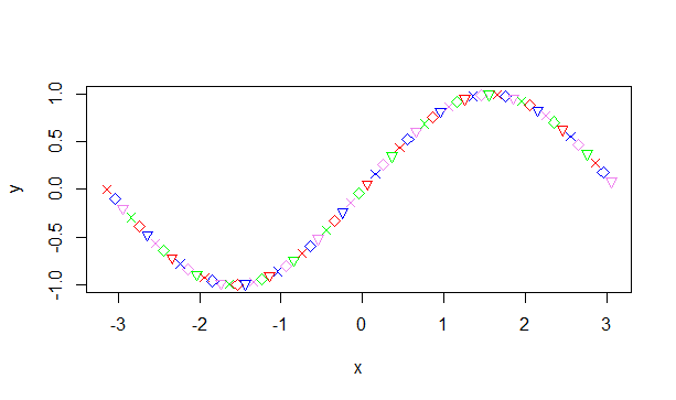
Now let’s attempt to alter the symbols and colors.
plot(x,y,pch=c(4,5,6),col=c('red','blue','violet','green'))
We have currently empowered the compiler to choose between three distinct symbols and four varied colors to label the graph. Let us observe the outcome.
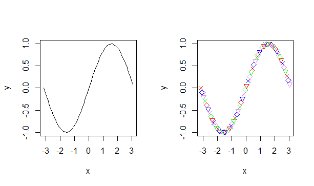
In R, the par() function enables us to merge multiple graphs into one image for easy viewing. All we have to do is adjust the spacing before utilizing the plot function in our visual representation.
#Set a plotting window with one row and two columns.
par(mfrow=c(1,2))
plot(x,y,type='l')
plot(x,y,pch=c(4,5,6),col=c('red','blue','violet','green'))
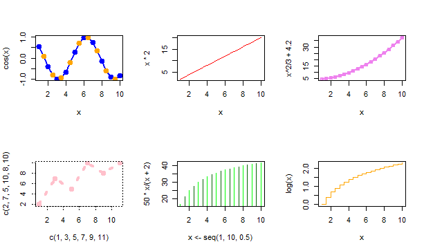
Below, you can find several additional graphs that employ different options mentioned earlier.
#Set space for 2 rows and 3 columns.
par(mfrow=c(2,3))

#Plot out the graphs using various options.
plot(x,cos(x),col=c('blue','orange'),type='o',pch=19,lwd=2,cex=1.5)

plot(x,x*2,col='red',type='l')

plot(x,x^2/3+4.2, col='violet',type='o',lwd=2,lty=1)

plot(c(1,3,5,7,9,11),c(2,7,5,10,8,10),type='o',lty=3,col='pink',lwd=4)

plot(x<-seq(1,10,0.5),50*x/(x+2),col=c('green','dark green'),type='h')

plot(x,log(x),col='orange',type='s')
This is how the graph appears.
Enhancing Graphs in R using the plot() Function by providing additional information.
Adding explanatory elements such as titles, axes, legends, and data point labels enhances the comprehensiveness of graphs. In R, we can explore the process of incorporating these elements into our graphs.
-
- You can customize the main title of a plot by using the main option in the plot function. Additionally, the font, color, and size of the title can be customized using the font.main, col.main, and cex.main respectively.
-
- To label the axes, you can use the xlab and ylab attributes. Similar to the main title, you can customize the font, color, and size of the axes labels using the font.lab, col.lab, and cex.lab attributes.
-
- If you want to add extra text within the plot, you can use the text attribute and specify both the text and the coordinates for display.
-
- The text attribute can also be used to label the data points. In this case, the text should be a vector of labels instead of a single string.
- To include a legend in the graph, you can use R’s legend() function. The legend function takes input for coordinates, text, and the symbols to interpret.
Now, let’s examine some instances that illustrate this.
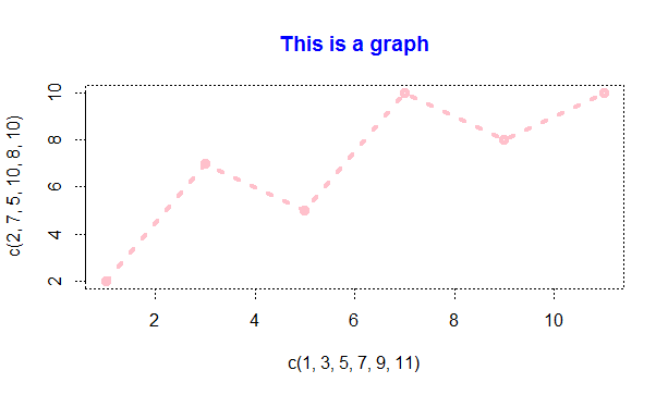
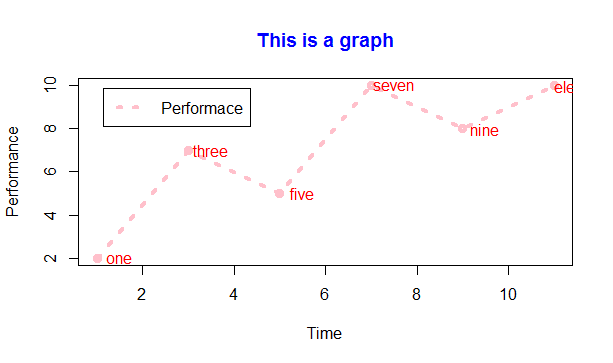
#Displaying the title with color
plot(c(1,3,5,7,9,11),c(2,7,5,10,8,10),type='o',lty=3, col='pink',lwd=4,main="This is a graph",col.main='blue')
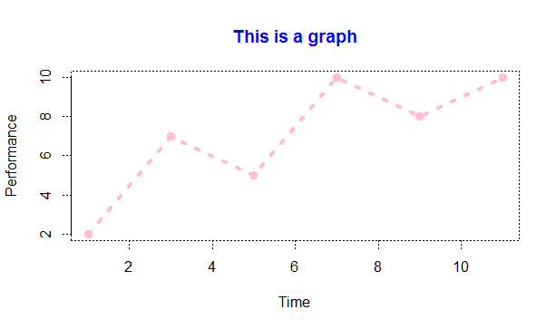
#Same graph with xlabel and ylabel added.

> plot(c(1,3,5,7,9,11),c(2,7,5,10,8,10),type='o',lt=3,col='pink',lwd=4,main="This is a graph",col.main='blue',xlab="Time",ylab="Performance")
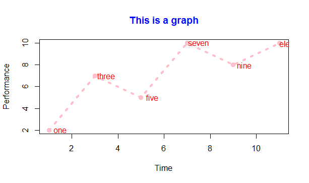
Using a text attribute, we can assign a label to every data point on the graph.
labelset <-c('one','three','five','seven','nine','eleven')
x1<- c(1,3,5,7,9,11)
y1 <- c(2,7,5,10,8,10)
plot(x1,y1,type='o',lty=3,col='pink',lwd=4,main="This is a graph",col.main='blue',xlab="Time",ylab="Performance")
text(x1+0.5,y1,labelset,col='red')
Lastly, we can use the legend() function to incorporate a legend into the graph mentioned above.
> legend('topleft',inset=0.05,"Performace",lty=3,col='pink',lwd=4)
You can indicate the position in two ways: by providing the coordinates (x and y) or by specifying a position such as ‘topleft’ or ‘bottomright’. ‘Inset’ implies shifting the legend box slightly towards the inside of the graph. As a result, the graph will now display a legend.
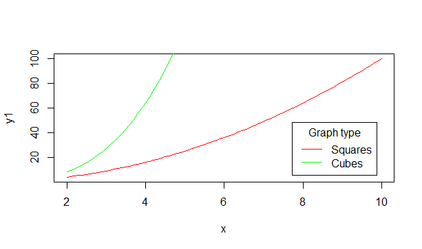
Graphs superimposed
In R, it is possible to display two graphs together on one window instead of opening a new window for each graph. This can be achieved by using the lines() function for the second graph instead of using plot() again. Such a feature is particularly useful when comparing metrics or different sets of values. Let’s consider an example.
x=seq(2,10,0.1)
y1=x^2
y2=x^3
plot(x,y1,type='l',col='red')
lines(x,y2,col='green')
legend('bottomright',inset=0.05,c("Squares","Cubes"),lty=1,col=c("red","green"),title="Graph type")
Including additional lines on a graph.
To incorporate straight lines into an existing plot, you can utilize the uncomplicated abline() function. This function relies on four parameters – a, b, h, and v. The variables a and b signify the gradient and y-intercept respectively. H pertains to the y coordinates for horizontal lines, whereas v denotes the x coordinates for vertical lines.
To clarify, let’s examine an example. After constructing the graph for squares and cubes, attempt to execute these three statements.
abline(a=4,b=5,col='blue')
abline(h=c(4,6,8),col="dark green",lty=2)
abline(v=c(4,6,8),col="dark green",lty=2)
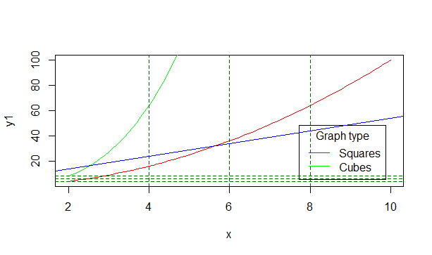
The initial blue line is constructed using the given slope and intercept. The consecutive groupings of three horizontal and vertical lines are then sketched at the mentioned x and y values, using a dotted line style denoted by lty=2.
This tutorial provides an introduction to the plot function in R. By utilizing other packages such as ggplot2, R is able to create visually appealing and dynamic graphics, as demonstrated in upcoming tutorials.

