Creating an Android ProgressBar utilizing Kotlin.
In this tutorial, we will explore and apply the use of ProgressBar in our Android Application using Kotlin.
Can you provide a definition of what a ProgressBar is?
The ProgressBar UI component is employed to exhibit the Progress on the application interface. A ProgressBar can be utilized to indicate the progress of download/upload on the application interface.
Different Types of Progress Bars
There exist two varieties of Progress Bar.
-
- Determinate ProgressBar: This type of ProgressBar allows you to monitor and display the progress that has been completed.
- Indeterminate ProgressBar: This version keeps going endlessly unless you manually stop it.
Showing a ProgressBar within an Alert Dialog is the purpose of a ProgressDialog. However, it is no longer recommended to use ProgressDialog because displaying prolonged progress in a dialog while obstructing the screen is not considered advisable.
Attributes of a ProgressBar
ProgressBar has several significant characteristics.
- android:indeterminate – used to specify the boolean value indicating the type of the ProgressBar
- android:max – The upper limit of the progress
- android:min – The lower limit of the progress
- android:progress – The steps by which the progress would be incremented.
- android:minWidth and minHeight – Used to define the dimensions of the ProgressBar
- android:progressBarTint – The tint color of the progress completed of the ProgressBar
- android:progressBarBackgroundTint – The tint color of the progress completed of the ProgressBar
- style – Used to set the style of the ProgressBar. By default it is circular. We can set the style as @style/Widget.AppCompat.ProgressBar.Horizontal for the Horizontal ProgressBar
- android:progressDrawable – Is used to set a drawable for the progress.
- android:secondaryProgress – Indicates the secondary progress value. This is used when we want to show the sub-downloads/subtasks progress.
The default tint colors are pre-set to the colorAccent that is specified in the styles.xml.
XML Layout for a progress bar.
Here is an example of a simple XML layout for a circular indeterminate ProgressBar:
<ProgressBar
        android:layout_width="wrap_content"
        android:layout_height="wrap_content"
        android:minHeight="50dp"
        android:minWidth="50dp" />
In the upcoming section, we will utilize Kotlin to incorporate diverse forms of ProgressBars into our Android application.
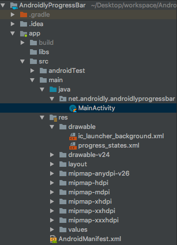
The structure of an Android ProgressBar Kotlin app project.
1. Code of XML Layout
Below is the code for the activity_main.xml layout.
<?xml version="1.0" encoding="utf-8"?>
<LinearLayout xmlns:android="http://schemas.android.com/apk/res/android"
    xmlns:app="http://schemas.android.com/apk/res-auto"
    xmlns:tools="http://schemas.android.com/tools"
    android:layout_width="match_parent"
    android:layout_height="match_parent"
    android:gravity="center"
    android:orientation="vertical"
    tools:context=".MainActivity">


    <ProgressBar
        android:layout_width="wrap_content"
        android:layout_height="wrap_content"
        android:minHeight="50dp"
        android:minWidth="50dp" />


    <ProgressBar
        style="?android:attr/progressBarStyleHorizontal"
        android:layout_width="wrap_content"
        android:layout_height="wrap_content"
        android:indeterminate="true"
        android:minHeight="50dp"
        android:minWidth="200dp" />


    <TextView
        android:id="@+id/textViewHorizontalProgress"
        android:layout_width="wrap_content"
        android:layout_height="wrap_content"
        android:text="0" />


    <ProgressBar
        android:id="@+id/progressBarHorizontal"
        style="?android:attr/progressBarStyleHorizontal"
        android:layout_width="wrap_content"
        android:layout_height="wrap_content"
        android:indeterminate="false"
        android:max="100"
        android:minHeight="50dp"
        android:minWidth="200dp"
        android:progress="1"
        android:progressBackgroundTint="@android:color/darker_gray"
        android:progressTint="@color/colorPrimary" />


    <Button
        android:id="@+id/btnProgressBarHorizontal"
        android:layout_width="wrap_content"
        android:layout_height="wrap_content"
        android:onClick="horizontalDeterminate"
        android:text="DETERMINATE HORIZONTAL PROGRESS BAR" />


    <RelativeLayout
        android:layout_width="wrap_content"
        android:layout_height="wrap_content">

        <ProgressBar
            android:id="@+id/progressBarSecondary"
            style="@style/Widget.AppCompat.ProgressBar.Horizontal"
            android:layout_width="wrap_content"
            android:layout_height="wrap_content"
            android:layout_centerInParent="true"
            android:minHeight="150dp"
            android:padding="8dp"
            android:minWidth="150dp"
            android:progressDrawable="@drawable/progress_states" />

        <TextView
            android:id="@+id/textViewPrimary"
            android:layout_width="wrap_content"
            android:layout_height="wrap_content"
            android:layout_centerInParent="true"
            android:textColor="#000" />

        <TextView
            android:id="@+id/textViewSecondary"
            android:layout_width="wrap_content"
            android:layout_height="wrap_content"
            android:layout_marginTop="25dp"
            android:layout_below="@+id/progressBarSecondary"
            android:textColor="@color/colorPrimaryDark" />


    </RelativeLayout>

    <Button
        android:id="@+id/btnProgressBarSecondary"
        android:layout_width="wrap_content"
        android:layout_height="wrap_content"
        android:text="DETERMINATE SECONDARY PROGRESS BAR" />


</LinearLayout>
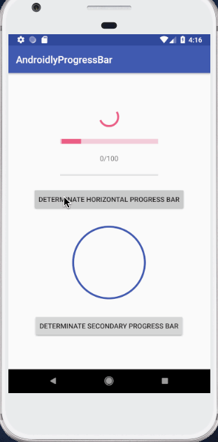
We have applied a progress drawable to the horizontal ProgressBar on the previous progress bar. The file progress_states.xml includes the drawable.xml for this purpose.
<?xml version="1.0" encoding="utf-8"?>
<layer-list xmlns:android="http://schemas.android.com/apk/res/android">
    <item android:id="@android:id/background">
        <shape android:shape="oval">
            <stroke
                android:width="4dp"
                android:color="@color/colorPrimary" />
            <solid android:color="@android:color/white" />
        </shape>
    </item>
    <item android:id="@android:id/secondaryProgress">
        <clip
            android:clipOrientation="vertical"
            android:gravity="bottom">
            <shape android:shape="oval">
                <stroke
                    android:width="4dp"
                    android:color="@android:color/black" />
                <solid android:color="@android:color/white" />
            </shape>
        </clip>
    </item>
    <item android:id="@android:id/progress">
        <clip
            android:clipOrientation="vertical"
            android:gravity="bottom">
            <shape android:shape="oval">
                <stroke
                    android:width="4dp"
                    android:color="@color/colorAccent" />
                <solid android:color="#F288F8" />
            </shape>
        </clip>
    </item>
</layer-list>
We have designed various states of the drawable, all of which are circular shaped. Each layer represents a different state – idle, secondary progress, and primary progress.
1. Code for the Main Activity in Kotlin
Let’s examine the code in the MainActivity.kt class in Kotlin.
package net.androidly.androidlyprogressbar

import android.support.v7.app.AppCompatActivity
import android.os.Bundle
import android.os.Handler
import android.view.View
import kotlinx.android.synthetic.main.activity_main.*

class MainActivity : AppCompatActivity() {


    var isStarted = false
    var progressStatus = 0
    var handler: Handler? = null
    var secondaryHandler: Handler? = Handler()
    var primaryProgressStatus = 0
    var secondaryProgressStatus = 0

    override fun onCreate(savedInstanceState: Bundle?) {
        super.onCreate(savedInstanceState)
        setContentView(R.layout.activity_main)


        handler = Handler(Handler.Callback {
            if (isStarted) {
                progressStatus++
            }
            progressBarHorizontal.progress = progressStatus
            textViewHorizontalProgress.text = "${progressStatus}/${progressBarHorizontal.max}"
            handler?.sendEmptyMessageDelayed(0, 100)

            true
        })

        handler?.sendEmptyMessage(0)


        btnProgressBarSecondary.setOnClickListener {
            primaryProgressStatus = 0
            secondaryProgressStatus = 0

            Thread(Runnable {
                while (primaryProgressStatus < 100) {
                    primaryProgressStatus += 1

                    try {
                        Thread.sleep(1000)
                    } catch (e: InterruptedException) {
                        e.printStackTrace()
                    }

                    startSecondaryProgress()
                    secondaryProgressStatus = 0

                    secondaryHandler?.post {
                        progressBarSecondary.progress = primaryProgressStatus
                        textViewPrimary.text = "Complete $primaryProgressStatus% of 100"

                        if (primaryProgressStatus == 100) {
                            textViewPrimary.text = "All tasks completed"
                        }
                    }
                }
            }).start()
        }

    }

    fun startSecondaryProgress() {
        Thread(Runnable {
            while (secondaryProgressStatus < 100) {
                secondaryProgressStatus += 1

                try {
                    Thread.sleep(10)
                } catch (e: InterruptedException) {
                    e.printStackTrace()
                }

                secondaryHandler?.post {
                    progressBarSecondary.setSecondaryProgress(secondaryProgressStatus)
                    textViewSecondary.setText("Current task progress\n$secondaryProgressStatus% of 100")

                    if (secondaryProgressStatus == 100) {
                        textViewSecondary.setText("Single task complete.")
                    }
                }
            }
        }).start()
    }

    fun horizontalDeterminate(view: View) {
        isStarted = !isStarted
    }

}
You have the option to download the project through the provided link: AndroidlyProgressBar.
More tutorials
Progress Bar iOS also known as Progress View(Opens in a new browser tab)
Using Kotlin Android SharedPreferences(Opens in a new browser tab)
A class in Kotlin that is sealed.(Opens in a new browser tab)
One example of Spring REST XML and JSON(Opens in a new browser tab)
Convert string to XML document in Java(Opens in a new browser tab)