アンドロイドのマテリアルデザインに基づいたボタンのスタイルデザイン
今日は、マテリアルデザインにおけるAndroidのボタンについて詳しく学び、異なるスタイルのボタンを紹介するアプリケーションを開発します。
アンドロイドのマテリアルデザインボタン
Androidのボタンは、私たちのアクションをアプリケーションに伝えるために使用されています。Material Designの導入により、前のバージョンのLollipop以前のデバイスでも互換性のあるさまざまな種類のボタンスタイルが登場しました。レイアウト内の基本的なボタンは、次のように定義されます。
<LinearLayout xmlns:android="https://schemas.android.com/apk/res/android"
xmlns:tools="https://schemas.android.com/tools"
android:layout_width="match_parent"
android:layout_height="match_parent"
android:orientation="vertical"
android:gravity="center"
tools:context="com.scdev.androidbuttonstyling.MainActivity">
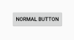
<Button
android:layout_width="wrap_content"
android:layout_height="wrap_content"
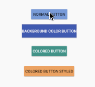
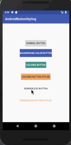
android:text="NORMAL BUTTON"/>
</LinearLayout>
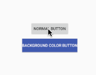
<Button
        android:layout_width="wrap_content"
        android:layout_height="wrap_content"
        android:background="@color/colorPrimary"
        android:textColor="@android:color/white"
        android:layout_margin="12dp"
        android:text="BACKGROUND COLOR BUTTON"/>
android:backgroundTint属性は、ボタン上のティント色を設定するためにも使用できます。ただし、Android SDK > 21の場合にのみ動作します。
「Androidボタンのスタイリング」
マテリアルデザインにおいて、ボタンは大まかに次の2つのカテゴリに分類されます。
- Raised Buttons – These are the default ones.
- Flat Buttons – These are borderless. They are typically used in dialogs
以下に利用可能な主なボタンスタイルがあります。
style="@style/Widget.AppCompat.Button"
style="@style/Widget.AppCompat.Button.Colored"

style="@style/Widget.AppCompat.Button.Borderless"
style="@style/Widget.AppCompat.Button.Borderless.Colored"
最後の2つのスタイルは「フラットボタン」のカテゴリーに含まれます。
アンドロイドのカラフルなボタン
以下の方法でボタンのデフォルト色付きスタイルを設定できます。
<Button
        style="@style/Widget.AppCompat.Button.Colored"
        android:layout_width="wrap_content"
        android:layout_height="wrap_content"
        android:layout_margin="12dp"
        android:text="COLORED BUTTON"
        android:padding="8dp" />
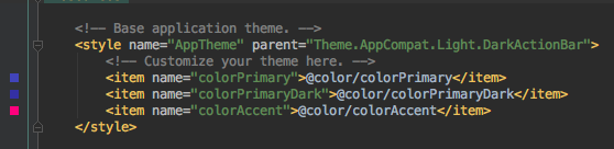
<resources>
<!-- Base application theme. -->
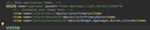
<style name="AppTheme" parent="Theme.AppCompat.Light.DarkActionBar">
<!-- Customize your theme here. -->
<item name="colorPrimary">@color/colorPrimary</item>
<item name="colorPrimaryDark">@color/colorPrimaryDark</item>
<item name="colorButtonNormal">@color/myBlue</item>
<item name="colorControlHighlight">@color/myWhite</item>
</style>
</resources>
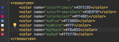
<style name="PrimaryColoredButton" parent="Base.Widget.AppCompat.Button.Colored">
        <item name="colorButtonNormal">@color/myPeach</item>
        <item name="colorControlHighlight">@color/myRed</item>
</style>
注記:ボタンのスタイルを親と同じくカラーに設定する必要があります。次のコードは、テーマが設定されたxml内のボタンです。
<style name="PrimaryColoredButton" parent="Base.Widget.AppCompat.Button.Colored">
        <item name="colorButtonNormal">@color/myPeach</item>
        <item name="colorControlHighlight">@color/myRed</item>
</style>
アプリケーションのデフォルトボタンスタイルを変更するには、styles.xml内のAppThemeスタイルのandroid:buttonStyle属性を使用することができます。
アンドロイドのフラットボタン
フラットなボタンは、境界線のないものや有色の境界線のないものなど、さまざまなスタイルがあります。カラーレスは、テキストの色が有色であることを意味しますが、背景は関与しません。styles.xmlファイルに以下のスタイルを追加してください。
<style name="FlatButton" parent="Theme.AppCompat.Light">
        <item name="android:textColor">@color/myPeach</item>
        <item name="colorControlHighlight">@color/myRed</item>
</style>
今、xmlレイアウトに以下のボタンを追加してください。
<Button
        style="@style/Widget.AppCompat.Button.Borderless"
        android:layout_width="wrap_content"
        android:layout_height="wrap_content"
        android:layout_margin="12dp"
        android:padding="8dp"
        android:text="BORDERLESS BUTTON" />

    <Button
        android:theme="@style/FlatButton"
        style="@style/Widget.AppCompat.Button.Borderless.Colored"
        android:layout_width="wrap_content"
        android:layout_height="wrap_content"
        android:layout_margin="12dp"
        android:padding="8dp"
        android:text="BORDERLESS BUTTON STYLED" />
Android Material Designボタンプロジェクトをダウンロードする